


BAR POSTERS

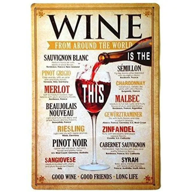
UOOPAI UOOPAI Tin Sign Wall Decor Retro Metal Plaque Bar Pub Vintage Poster Set of 4 with No Working Beer Wine Group Therapy
Brand: UOOPAIColor: Drink BeerFeatures: Size: 8 inch x 12 inch Material: tin/Metal Great for your kitchen, dining room, bar, pub, home, diner, man cave, or anywhere you have wall space Pre-drilled holes for easy hanging on the wall Each sign comes in its own poly bag Binding: KitchenDetails: It is essential for kitchen, dining room, living room, bar, pub, man cave, coffee house, all kinds of individual character places or home decoration.EAN: 0749882855802Package Dimensions: 12.1 x 8.3 x 0.4 inches
$ 69.99$ 62.49


Bar posters are a great way to show off the drinks and food your bar can provide. It saves you time from bringing a menu to customers and promotes your best dishes and cocktails. They're also an excellent way to fill up the vertical space and make the bar look less empty.
What Makes an Effective Bar Poster
Text
Make sure that your text is understandable. Posters are not as effective if your customers cannot read them properly.
Images
Pictures can grab your customers' attention, and they will continue to read what's on the poster. If you put up a sign with a whole essay, most customers will ignore it and end up useless.
Spacing
A crowded poster will look unappealing to people. You need a focal point for the viewer. An excellent focal point is the menu images evenly distributed or your special dish.
Color
Bright colors may grab attention, but they may not match your bar theme. Muted background colors can help your poster complement the decoration and help the subject pop out without overpowering the room's flow.
Emphasis
You need to emphasize the images for menu posters as people tend to order based on appearance and food appeal. You can also highlight specials or best sellers to attract the customer's eye.
Balance
This ties in with spacing. You need a balanced amount of images and texts. Too many images can be sensory overload, while too many texts can be tedious.
Contrast
Remember that contrast can help place the focus on the right areas. The text should pop out of the poster, and images should not blend into the background.
White Space
People tend to forget the negative space and how it functions in a poster. Negative space helps establish hierarchies and organization in signs. It helps determine the important sections and leads you towards them.