BAR POSTERS


Giwawa Giwawa Menu Retro Bars Signs Vintage Bar Metal Tin Sign Pubs Menu Retro Pub Poster Ptyle Wall Art Pub Bar Decor Retrospective Menu Bar Pubbed Tin Signs Man Cave Wall Painting 12 X 8in,Man Cave
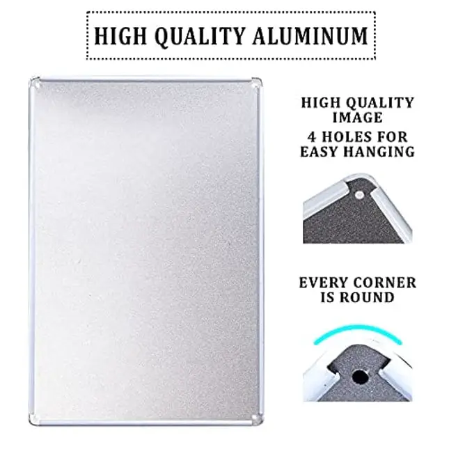
4 ReviewsBrand: GiwawaColor: MenuFeatures: 💕Durable - 12" X 8"Menu Retro Bars Metal Sign,Made Of .036 Aluminum With Rounded Corners Signs Have Rounded Corners For Safe Handling, Longer Life And A Professional Appearance. Can Be Used Both Indoors And Outdoors,Never Rust.Made Of Industrial Grade Aluminium, Can Be Displayed For A Long Time Whether Indoors Or Outdoors.The Signs Use Gray Ink Coating Prevent Aluminum Anodic Oxidation. 💕Vintage - Unique UV Printing Technology,True Rich Color Quality For Unmatched Vibrancy, Color Reproduction And Extremely Detailed Image Quality. Vintage Pubbed Sign,Rust And Scratches Give Bar Wall Sign Perfect Retro Feel,Look Great In Any Bar Kitchen Man Cave Coffee Home. 💕Pubs Sign Wall Card Easy To Hang - Comes With Screw Holes And It' Can Be Mounted With Double-Sided Foam Tape,Command Strips Or Nails.All Of Our Signs Have Pre-Drilled Holes And Can Be Easily Mounted On Any Surface. 💕The Perfect Gift -About The Same Size As A Piece Of A4 Paper,Suitable For Any Scene. A Truly Unique Gift, Guaranteed To Bring A Smile To Everyone. 💕If You Have Any Questions About The Pub Tin Painting, Please Contact Us In Time Binding: KitchenDetails: Are you in need of some mighty motivational artwork at home or in your workout area? Bring a touch of nostalgia into your home or garage? if you want,i believe our shop will meet your demand,you can find thousands kinds of ting sign in our store.all tin signs are a perfect addition to any area or room. display them wherever you choose. Indoor or outdoor. Homes Apartments Offices Cubicles College dorms Classrooms Pubs Restaurants Basements Garages Patios Porches Man Caves Kitchens Bathrooms Bedrooms Hallways.Plus our tin signs are weather resistant enough for use on outside walls, fences and gates. So basically… ANYWHERE!Our tin signs have rolled edges, so they are safe to handle. They all have 4 Pre-drilled holes in each sign for easy mounting. Simply use tacks, pushpins, hooks, small nails or screws even use magnets or any kind of tape.also makes a fantastic gift! this sign has some extra Rust patina - for that cool look and feel!perfect gift for men women kids friend!have a nice shopping time! Thank You Visit Our Shop!EAN: 6914186048401Package Dimensions: 11.8 x 7.9 x 0.2 inches
$ 11.65
Bar posters are a great way to show off the drinks and food your bar can provide. It saves you time from bringing a menu to customers and promotes your best dishes and cocktails. They're also an excellent way to fill up the vertical space and make the bar look less empty.
What Makes an Effective Bar Poster
Text
Make sure that your text is understandable. Posters are not as effective if your customers cannot read them properly.
Images
Pictures can grab your customers' attention, and they will continue to read what's on the poster. If you put up a sign with a whole essay, most customers will ignore it and end up useless.
Spacing
A crowded poster will look unappealing to people. You need a focal point for the viewer. An excellent focal point is the menu images evenly distributed or your special dish.
Color
Bright colors may grab attention, but they may not match your bar theme. Muted background colors can help your poster complement the decoration and help the subject pop out without overpowering the room's flow.
Emphasis
You need to emphasize the images for menu posters as people tend to order based on appearance and food appeal. You can also highlight specials or best sellers to attract the customer's eye.
Balance
This ties in with spacing. You need a balanced amount of images and texts. Too many images can be sensory overload, while too many texts can be tedious.
Contrast
Remember that contrast can help place the focus on the right areas. The text should pop out of the poster, and images should not blend into the background.
White Space
People tend to forget the negative space and how it functions in a poster. Negative space helps establish hierarchies and organization in signs. It helps determine the important sections and leads you towards them.


